——––> Announcement video
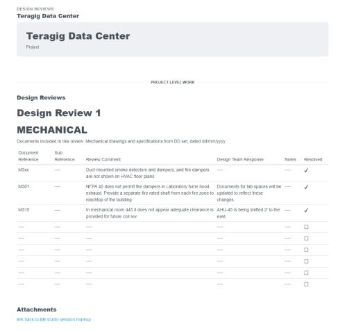
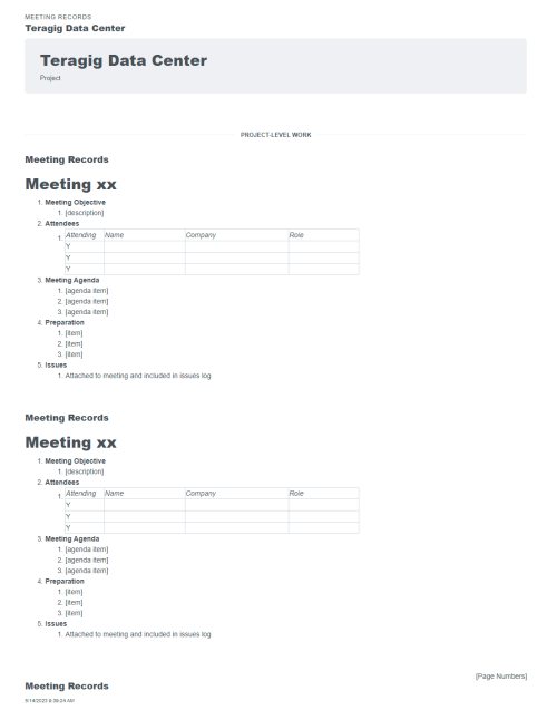
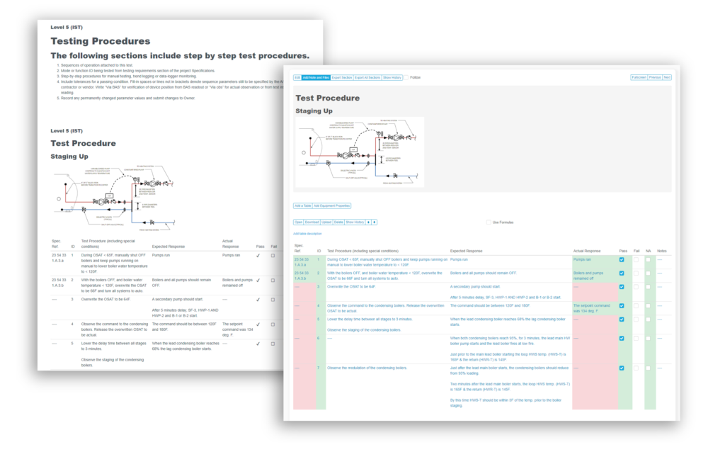
Updated page layouts, improved UX, light-mode
We’re investing heavily in making Bluerithm look nicer, flow smoother, and to making it easier and nicer to use in general. We hired a UX specialist to help in these efforts.
The first couple steps are done, and we’ve received great feedback on the updated look and feel of the web portal.
As part of this, a “light mode” theme is available that you can toggle on or off on your profile page.


Procore integration fully released
This has been done for quite some time, but we held off on a broad release as we rolled a few of the following updates into it, including an update we requested from Procore to their API.
Through our partnership with Procore, we were able to advocate for an updated API endpoint that allows fully-formatted text to pass back and forth between Procore and Bluerithm on synchronized issue/observation descriptions.

Full text editor
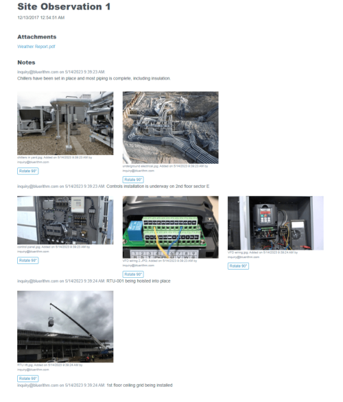
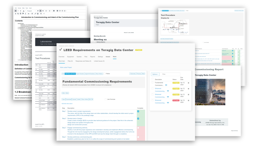
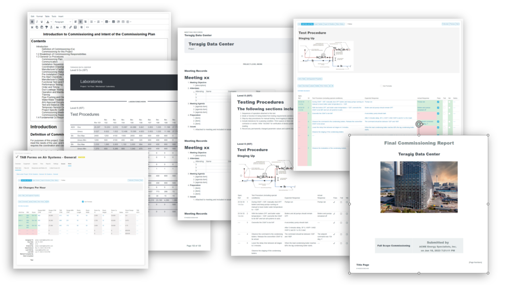
Sometimes a little extra formatting goes a long way to making complex information easier to understand, so we’ve added full-text editing capability to work items / forms / checklists / issues / notes / etc.
Text editing is now supported in the web portal and mobile apps, as well as with the Procore integration.

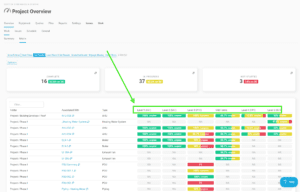
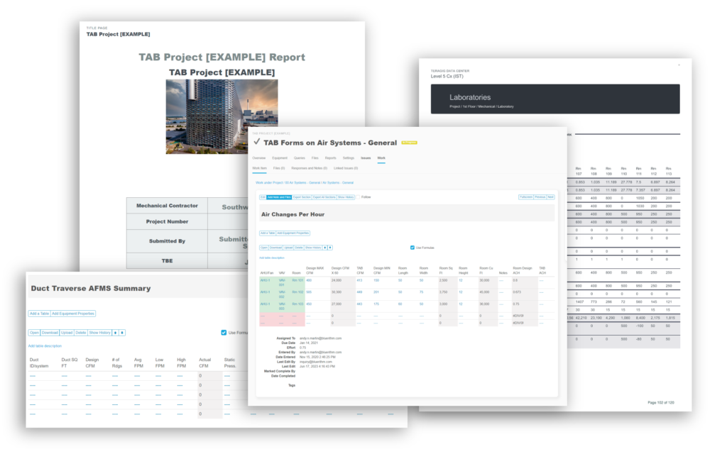
Automatic form matrix builder
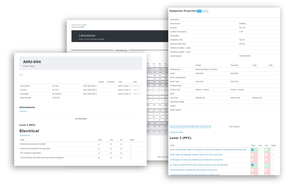
This feature gives you matrix style forms with data from multiple forms on multiple equipment. It’s powerful and will allow you to be efficient, as well as keep your data in a structure that’s compatible with industries standards like COBie, etc.

Issue draft status
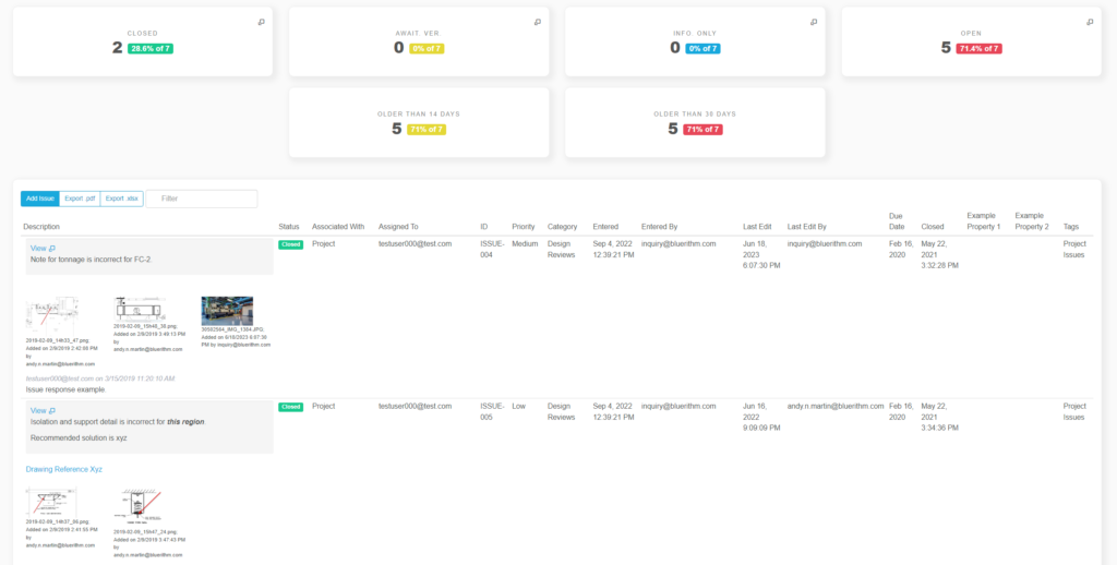
An improved workflow that allows you to keep issues internal to your team for reviews, updates, etc. before releasing to respondents and other stakeholders.

Mobile app updates (iOS, Android, Windows)
Corresponding updates to the mobile apps have been made. The one exception is the form matrix, which isn’t available yet in the apps.
————————————————————–
Start a free Bluerithm account here: https://bluerithm.com

